A long shot.
-
@jwildeboer There are different Fonts at play here. The one on the buttons looks like Eurostyle.
@animaux @jwildeboer
Yes, there might even be 3 fonts in use. -
@animaux @jwildeboer
Yes, there might even be 3 fonts in use.@raymaccarthy @jwildeboer I think we can top that!
")
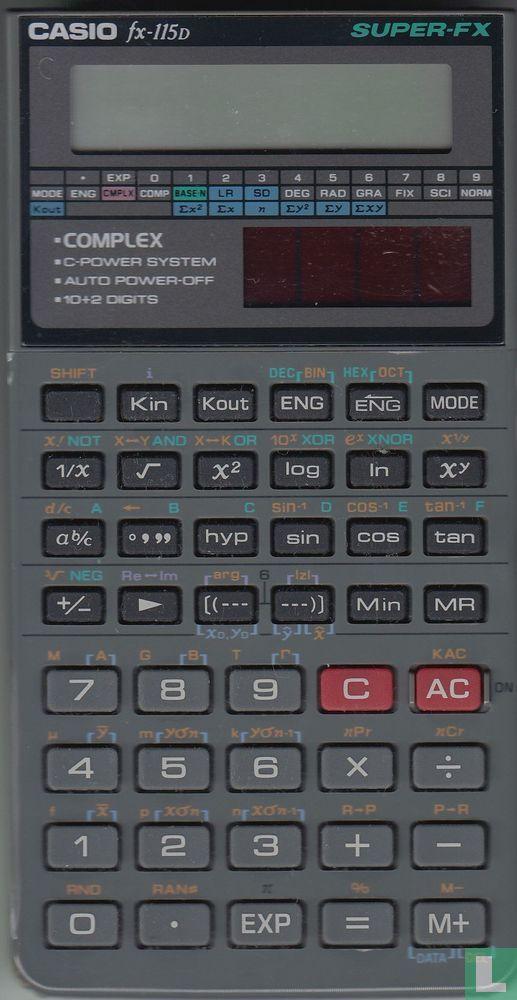
1. Casio logo-font
2. Serif »fx-115D«-font
3. Italic »SUPER«-font
4. Font for »COMPLEX«
5. Button and on-display-fonts (Eurostyle)
6. possibly extra fonts for greek letters and mathematic symbolsMaybe @kupfers likes to chime in?
-
A long shot. Does anyone know if the font/typeface that Casio used for the keys on their calculators back in the days is available as TrueType or SVG anywhere? I am weirdly fascinated by it and would love to use it for some displays.
Off hand I'd say that was Eurostile / Microgramma.
There might be an inexpensive font that is similar
https://typesetinthefuture.com/2014/11/29/fontspots-eurostile/
-
@raymaccarthy @jwildeboer I think we can top that!
1. Casio logo-font
2. Serif »fx-115D«-font
3. Italic »SUPER«-font
4. Font for »COMPLEX«
5. Button and on-display-fonts (Eurostyle)
6. possibly extra fonts for greek letters and mathematic symbolsMaybe @kupfers likes to chime in?
@animaux @raymaccarthy @kupfers Eurostile not Eurostyle
") /pedantic
/pedantic -
A long shot. Does anyone know if the font/typeface that Casio used for the keys on their calculators back in the days is available as TrueType or SVG anywhere? I am weirdly fascinated by it and would love to use it for some displays.
@jwildeboer Those numeric keys go way back. The same lettering for the digits was used for the Casio fx-8 in 1977; that was Casio's first handheld scientific calculator with a LCD screen.
The first Casio battery handheld scientific calculator, the fx-1 (1972) and its successor the fx-10 (1974), used a different font for the numeric keys and had LED displays.
So I doubt you'll get an exact match for the typeface from original materials. Something close will have to do.
-
Thank you all! Consensus seems to be that Eurostile [1] and Microgramma-d [2] are very close. The TTFs that Casio itself distributes [3] for teachers are not really that clean, in my opinion, and only contain the keys, not the other characters.
UPDATE: Bitstream Square 721 Std is even closer and might be The One
[1] https://fontsgeek.com/eurostile-font
[2] https://fontsgeek.com/microgramma-d-extended-font
[3] https://edu.casio.com/forteachers/er/fontsets/index.php@jwildeboer To be clear, Microgramma is the original, from all the way back in 1952, and was uppercase only.
In the early 60s, two versions that extended it with lowercase letters were made, one of which was Eurostile (while the other remained Microgramma).
Various digitizations of both fonts were later made, including Bitstream's version, which would have been some time in the 80s/early 90s, and seems to have been made specifically from Eurostile.
-
@jwildeboer To be clear, Microgramma is the original, from all the way back in 1952, and was uppercase only.
In the early 60s, two versions that extended it with lowercase letters were made, one of which was Eurostile (while the other remained Microgramma).
Various digitizations of both fonts were later made, including Bitstream's version, which would have been some time in the 80s/early 90s, and seems to have been made specifically from Eurostile.
@jwildeboer Oh, and btw, the word COMPLEX on that fx-115D is set in Handel Gothic.
-
@jwildeboer To be clear, Microgramma is the original, from all the way back in 1952, and was uppercase only.
In the early 60s, two versions that extended it with lowercase letters were made, one of which was Eurostile (while the other remained Microgramma).
Various digitizations of both fonts were later made, including Bitstream's version, which would have been some time in the 80s/early 90s, and seems to have been made specifically from Eurostile.
@mangled_pixel TIL (Today I Learned)! Thank you for sharing this
-
@mangled_pixel TIL (Today I Learned)! Thank you for sharing this
@jwildeboer Happy to help. Oh, and I've often used Michroma (https://fonts.google.com/specimen/Michroma) as an alternative to Eurostile/Microgramma, if you're looking for something free in the same style, without worrying about complete accuracy.
-
A long shot. Does anyone know if the font/typeface that Casio used for the keys on their calculators back in the days is available as TrueType or SVG anywhere? I am weirdly fascinated by it and would love to use it for some displays.
@jwildeboer looks like Microgramma?
-
@jwildeboer it looks like a vertically squashed version of Eurostile
@ancient_domains_of_word @jwildeboer
Eurostile Candy? -
@jwildeboer Happy to help. Oh, and I've often used Michroma (https://fonts.google.com/specimen/Michroma) as an alternative to Eurostile/Microgramma, if you're looking for something free in the same style, without worrying about complete accuracy.
@mangled_pixel Ah, that’s the complicated thing. I do care about accuracy and I will happily pay for that, as my folder with typefaces I bought over the years proves
-
A long shot. Does anyone know if the font/typeface that Casio used for the keys on their calculators back in the days is available as TrueType or SVG anywhere? I am weirdly fascinated by it and would love to use it for some displays.
@jwildeboer@social.wildeboer.net @formschub@fnordon.de Du vielleicht?
-
@mangled_pixel Ah, that’s the complicated thing. I do care about accuracy and I will happily pay for that, as my folder with typefaces I bought over the years proves
It is a lovely font, I can see why you’re fixated on it.
-
@ilkkajii might have some clues.
@pahoittelemme @jwildeboer Seems that internet was faster than me. Again.

-
@mangled_pixel Ah, that’s the complicated thing. I do care about accuracy and I will happily pay for that, as my folder with typefaces I bought over the years proves
@jwildeboer It's an interesting era to do font identification in, as the 90s were the transition period between pad-printing (such as on a device like that) being designed with with dry-transfer lettering like Letraset (possibly manipulated with phototypesetting methods), to digital. That design has a few examples where the letters are clearly squashed/stretched to fit the keys, which would have been hard (though not impossible) to achieve with phototypesetting, but easy to do digitally.
-
@jwildeboer It is very similar to Eurostile. There is a free version of that around called QT Eurotype (developed for use in LaTeX iirc but available as OpenType)
@Hans @jwildeboer definitely eurostile. Just look at that lovely long bar on the G, or the 'swoosh' at the junction of the K
Casio also used Eurostile on the G-Shock and F91 series of watches, so I think it's more likely than not to be the same typeface on the calculator
-
@lfourrier The ones on the keys. It seems Bitstream Square 721 Std Extended is very close.
@jwildeboer It seems to me it is perhaps between regular and extended , but it’s clearly not far
-
Thank you all! Consensus seems to be that Eurostile [1] and Microgramma-d [2] are very close. The TTFs that Casio itself distributes [3] for teachers are not really that clean, in my opinion, and only contain the keys, not the other characters.
UPDATE: Bitstream Square 721 Std is even closer and might be The One
[1] https://fontsgeek.com/eurostile-font
[2] https://fontsgeek.com/microgramma-d-extended-font
[3] https://edu.casio.com/forteachers/er/fontsets/index.phpAnd now I want dark blue keycaps with white Microgramma characters for my keyboard. Damn
-
A long shot. Does anyone know if the font/typeface that Casio used for the keys on their calculators back in the days is available as TrueType or SVG anywhere? I am weirdly fascinated by it and would love to use it for some displays.
@jwildeboer Did anyone else press the buttons on that photo? No? Just me then.
