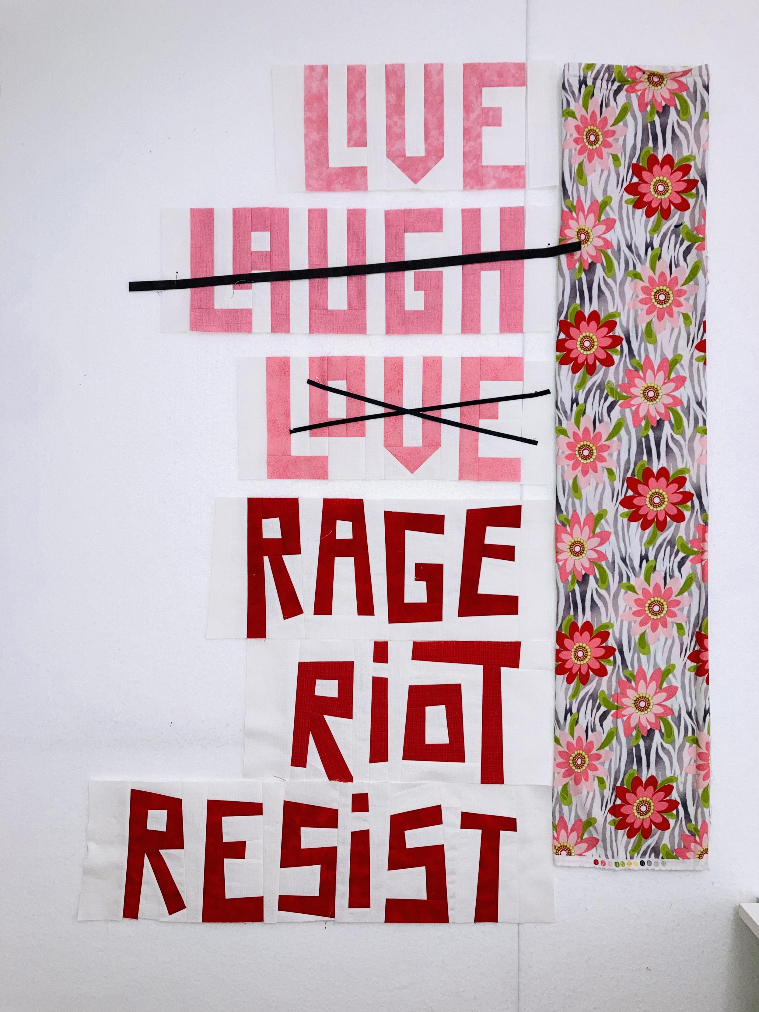
Definitely needs the two thinner lines for crossing out instead of the one thick line, right?
-
Definitely needs the two thinner lines for crossing out instead of the one thick line, right?
Of course, I’m out of the ¼ in bias tape

 ️
️ -
Definitely needs the two thinner lines for crossing out instead of the one thick line, right?
Oooooh love this ! You're brilliant as always
I'm curious, did you find this slogan yourself or did you see it somewhere ?
I'm always in search of meaningful but short slogans (I do hand embroidery, too many letters are hard !) even if I see plenty of stickers in the city, I always lurk for moreAnd I do like the 2 lines crossing out the words better, I think it's clearer, but I don't know if you're post was a question or a self ask but here I am
-
Definitely needs the two thinner lines for crossing out instead of the one thick line, right?
@inarticulatequilter Actually, I like having both.
-
Definitely needs the two thinner lines for crossing out instead of the one thick line, right?
-
Definitely needs the two thinner lines for crossing out instead of the one thick line, right?
@inarticulatequilter I prefer the look of the thicker line, and wonder if crossed thick lines wouldn't be even better xP
-
@inarticulatequilter I prefer the look of the thicker line, and wonder if crossed thick lines wouldn't be even better xP
@eishiya I'll try it out tomorrow. I'm worried it'll cover too much of the words, so they aren't easily readable
-
Definitely needs the two thinner lines for crossing out instead of the one thick line, right?
@inarticulatequilter RRRight!
-
@inarticulatequilter Actually, I like having both.
@artcollisions interesting take! That would give it an even less 'careful' vibe
-
Oooooh love this ! You're brilliant as always
I'm curious, did you find this slogan yourself or did you see it somewhere ?
I'm always in search of meaningful but short slogans (I do hand embroidery, too many letters are hard !) even if I see plenty of stickers in the city, I always lurk for moreAnd I do like the 2 lines crossing out the words better, I think it's clearer, but I don't know if you're post was a question or a self ask but here I am
@Flamboyantes_Terres This saying I got from Pinterest. I like finding inspiration in street art, too, but I'll work with any memes or pop culture phrases that speak to me. I like seeing how working in fabric transforms the original intent
I'm about to start one of my longest quilted statements yet and I'm doing a couple of these smaller ones to get in practice again. But, yeah, sometimes embroidery is the only choice!
My question wasn't rhetorical! Thanks for weighing in in favor of two lines
-
@eishiya I'll try it out tomorrow. I'm worried it'll cover too much of the words, so they aren't easily readable
@inarticulatequilter It might need some careful positioning to avoid covering up important parts of the letters.
The thin ones look too much like "oops dropped something on the quilt" to me, the thick ones look more intentional.
-
 E eyjala@mastodon.social shared this topic